Creating digital experiences our clients fall in love with
We work with clients to grow their digital business and generate real results. View some of our recent case studies below.
Recent work examples
Walking the distance to improved user experience
Custom website design, Google Ads, Facebook Ads
Raising awareness through custom resources
Custom website design, custom web development
Streamlined bookings, and increased traffic. 512% increase in conversions.
Website design, Google Ads, Logo Redesign
Supporting people, supporting leads.
Website design, SEO, UI/UX, Landing page optimisation
Raising the bar for FIT College. Conversion rate increase of 83%
Website design, SEO, Digital Marketing

Helping to build the Morcraft Homes brand to increase credibility and conversions.
Website design, SEO, Digital Marketing
Smiles all round after vibrant new brand for local dental clinic sees bookings increase 300%.
Brand identity, Website design, Digital Marketing

Fully integrated ERP system.
Ostendo Integration, Website design,
Making sure everything flows smoothly for Drains Kleen. Conversion rate improves 70%.
Website design, Copywriting, SEO, Digital Marketing
Kook turned up the heat on Oasis Spas' digital marketing strategy, leading to a 130% increase in leads.
SEO & webmastering, Digital advertising

We help keep the wheels turning with programming solutions for Australia's leading transit advertising company.
Website design, Custom programming, Software integration
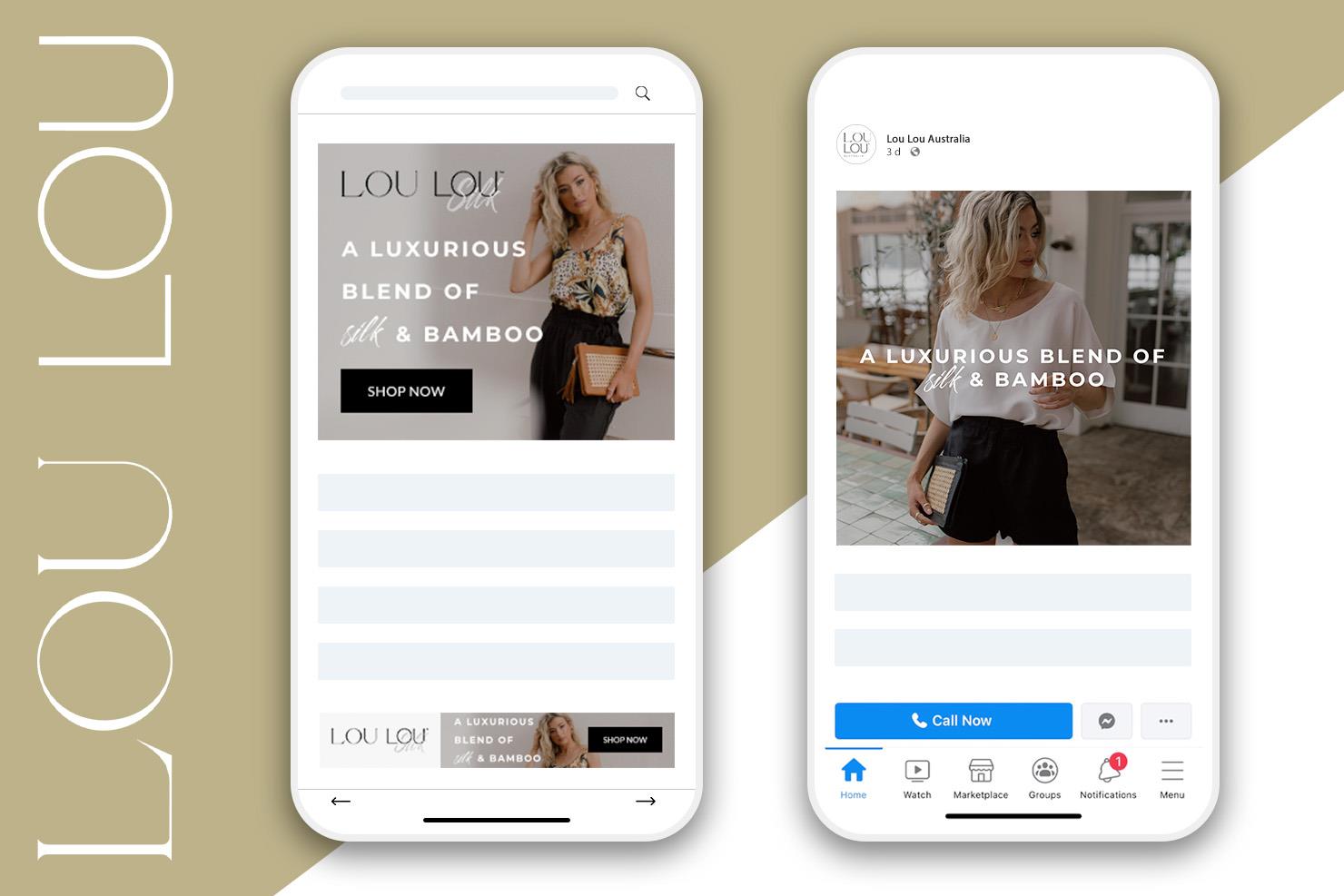
Dressed for success. Digital marketing strategy for this luxury online bamboo clothing retailer sees 150% sales increase.
SEO & Webmastering, Paid advertising

A golden first impression for potential stakeholders and partners for PNG-based mining company.
Brand identity, Website design

Modern, fresh identity for established Sunshine Coast-based building certification company, Pacific BCQ.
Logo design, Website design
We revved up business for auto locksmith Kev's Car Keys with an SEO program that quadrupled organic traffic.
SEO & Webmastering

We helped raise the roof on advertising for The Roofing Group.
Website design, SEO, Webmastering & Google Ads
These cute and cuddly Sunshine Coast products are a serious international success.
Logo Design, ecommerce, software integration, business process, SEO & Webmastering, Paid advertising

Kook helps keep the high-gloss finish on Carmex lip balm landing pages.


